Workaround to add a notification bar to a Divi theme WordPress site
March 21, 2020 /
Here’s an easy workaround to add a notification bar to your WordPress site with the Divi theme without using a plugin. As a work-around, it doesn’t include tons of options but it’s work-able and you don’t need any plugins. In fact a lot of notification bar plugins won’t work with the Divi theme so this has saved me a few times for clients needed a quick solution.
This works best on sites not making use of the Divi secondary menu because that’s what you’ll use to make your notification bar and then add some code to get it working on mobile devices as well if you desire.
So first let’s setup the desktop notification bar, or as it’s sometimes referred to, a hello bar.
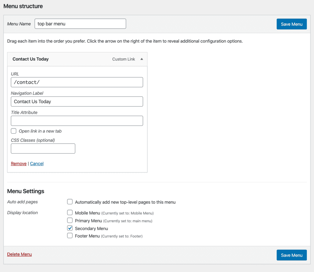
 2) Add a custom link with the text we want to use. For the link you can use a telephone number, your contact page or maybe a new blog post or news article that you’ve created. You could also give a section on your home page a div id and link to it to scroll down by using #yoursectionid. Whatever makes sense. If there’s nothing that makes sense, then you can also use #.
3) Before you click the “Save Menu” button or after if you already did it, click Secondary Menu in the Menu Settings. Now click the “Save Menu” button.
 Now you have a top bar or as it’s sometimes called, super nav bar with your message at the top of the site. You can change the size and background color via the Divi theme customization settings.
The text (or rather link) is also text-aligned and floated right but we can adjust that with some quick custom css added to the Custom CSS box in Divi theme options which are at yoursite.com/wp-admin/admin.php?page=et_divi_options.
Desktop Notification Bar for Divi
1) We’ll add a custom menu and name it. We used “top bar menu” but it doesn’t matter what the name is. Remember to click the “Create Menu” button. 2) Add a custom link with the text we want to use. For the link you can use a telephone number, your contact page or maybe a new blog post or news article that you’ve created. You could also give a section on your home page a div id and link to it to scroll down by using #yoursectionid. Whatever makes sense. If there’s nothing that makes sense, then you can also use #.
3) Before you click the “Save Menu” button or after if you already did it, click Secondary Menu in the Menu Settings. Now click the “Save Menu” button.
 Now you have a top bar or as it’s sometimes called, super nav bar with your message at the top of the site. You can change the size and background color via the Divi theme customization settings.
The text (or rather link) is also text-aligned and floated right but we can adjust that with some quick custom css added to the Custom CSS box in Divi theme options which are at yoursite.com/wp-admin/admin.php?page=et_divi_options.
#et-secondary-menu {
    float: none;
    margin: auto;
    width: 320px; //adjust as needed
}
Notification Bar for Mobile Using the Divi Theme
Now that you have a top bar with your message on desktop. You might also want to show it on mobile. The following CSS works for me but I will caution you that you’ll probably need to adjust some values to get it work with your menu settings. It’s all important to note that the WordPress admin can throw you off when your testing it so you might want to hide that for your user or just use another browser or browser profile. Hopefully this helped you./* Secondary bar on mobile */
@media (max-width: 980px) {
.et_secondary_nav_only_menu #top-header,
#et-secondary-nav, #et-secondary-menu {
display: inline-block !important;
}
.et_non_fixed_nav.et_transparent_nav_temp #main-header,
.et_secondary_nav_only_menu #main-header,
.et_fixed_nav_temp #main-header,
.et_secondary_nav_only_menu #main-header {
top:40px !important;
}
#et-info, #et-secondary-menu > ul > li a {
padding-top: 0.75em;
}
}
@media (max-width: 598px) {
#et-secondary-nav li {
text-align: center;
}
#et-secondary-menu {
width: 100%;
}
}
@media (max-width: 463px) {
.et_non_fixed_nav.et_transparent_nav_temp #main-header,
.et_secondary_nav_only_menu #main-header,
.et_fixed_nav_temp #main-header,
.et_secondary_nav_only_menu #main-header {
top: 56px!important;
}
}
Posted in WordPress
