Dawn Theme 4 Column Grid Html
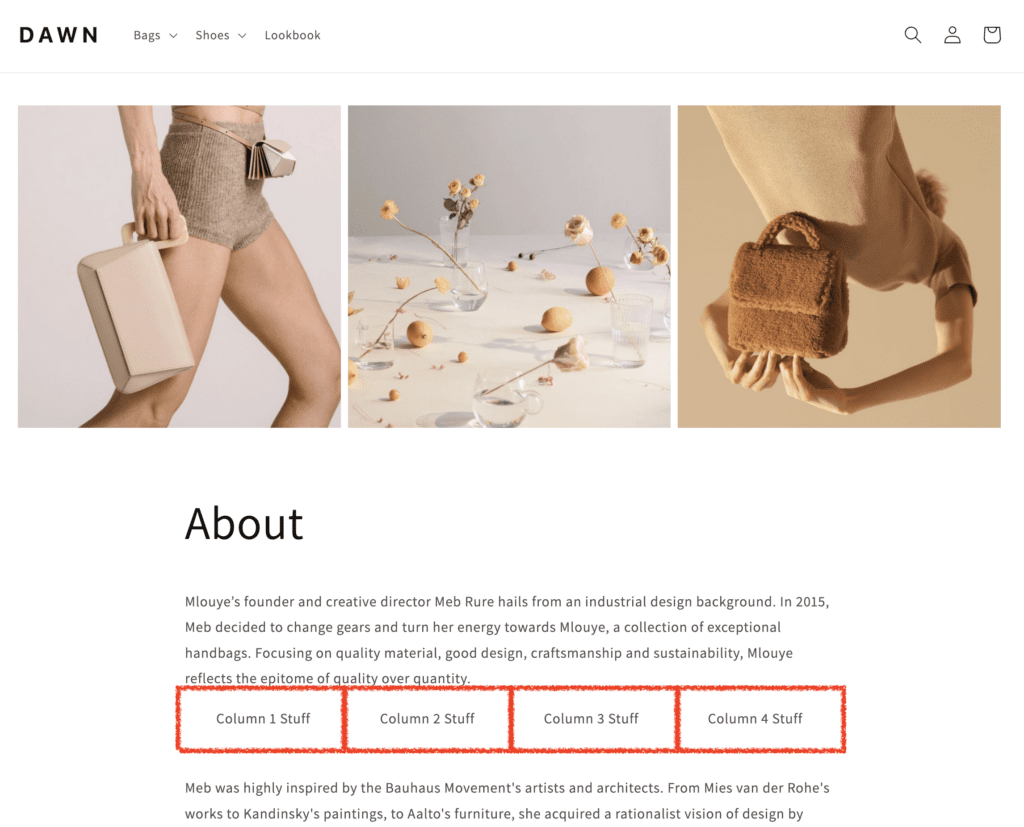
Here's how to add 4 responsive columns to add any page without a custom page template using these built-in css classes in the popular Online Store 2.0 Dawn theme for Shopify. Simply end the page and switch to the "text" view and paste this html structure. Note that the "center" class on the individual column divs will center the text.
<div class="row grid grid--1-col grid--2-col-tablet grid--4-col-desktop">
	<div class="grid__item center">Column 1 Stuff</div>
	<div class="grid__item center">Column 2 Stuff</div>
	<div class="grid__item center">Column 3 Stuff</div>
	<div class="grid__item center">Column 4 Stuff</div>
</div>
No new CSS to add your theme CSS. The grid classes are built in to the Dawn theme. Note: This was tested on the Dawn version 3.0.0 theme.
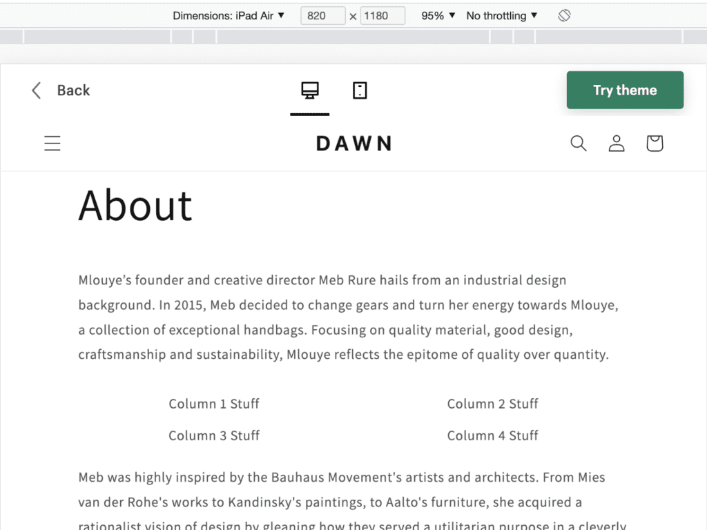
2 Columns in Tablet View
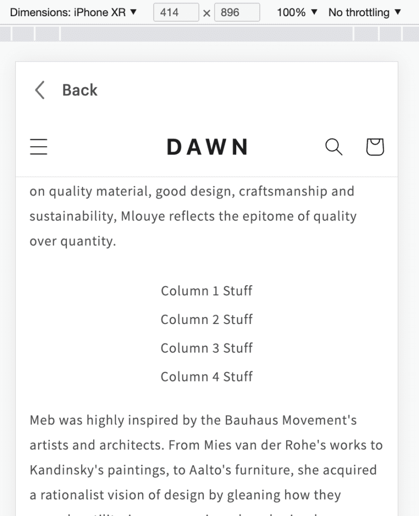
Single Column in Mobile View